Sunday, 27 December 2015


Tuesday, 22 December 2015
51- Where my ideas are from
My digipak ideas were influenced by a number of different artist that i believe are similar to Renee.
The first digipak that caught my eye was Adele's album cover 25.

 I like the idea of using two pictures for the front and the back of the album cover. I also like the close up on the front cover and the black and white effect.
 I got a few of my ideas from Ariana Grande's website, what i like about the website is that the picture she used for her home page is linked to her new album 'Focus', this is good for promoting her new album. Further more i also liked the idea of having different links that will automatically take you to any of her social media accounts, and also links to buy her new album on the centre of her home page.
The first digipak that caught my eye was Adele's album cover 25.


50- short list
Shortlist of fonts, colours, layout and design ideas
Fonts

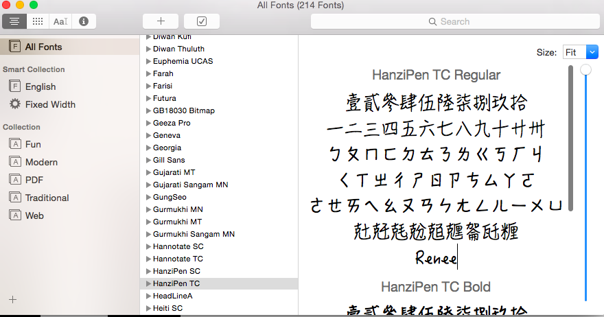
I want this font to be used for the sub-heading for the website, for example- Photos,Home etc.
Colour
The colour scheme have chosen to be used for the ancillary work is black, white and red. These are basic colour that also match with our synergy which in red.
Sunday, 20 December 2015
Analysing Websites
The artists website which I looked at was Jessie J's


The links included on the website are News, Tour Dates, Bio , Music , Gallery , Videos , Store.
The fonts are Bold which makes your eyes focus on that specific text first, the text are mostly capitalised and big.
How the website speaks to the audience....?? It tells the audience to visualise things. Due to the plain background and her eyes being closed, conveying that she is visualising something.
Saturday, 19 December 2015
Analysing Digipaks
One example of a digipak which I looked at was Carly Rae Jepsen's.
She seems to have a bright coloured theme in all the work she produces. This is smart because in a way that could be her ancillary (Bright colours)

BUT, the album cover that I looked at was completely different to her usual style.
The central image on the front of the panel is of her sitting on something looking into the distance.
The fonts which were used are basic mixed with stylish/ creative fonts.
Black is the main colour used which some white , blue & her jumper is colourful which adds colour and focus to that specific mise en scene. It also makes HER stand out too. Also roman numerals are used.

How does the digipak link to the music video....??
Her video "I really like you" doesn't link to the music video as she isn't in the music video throughout.. only in the end she's incorporated into the music video. Which can be strange, as music videos are meant to be about just the artist themselves. But the clothes which she wore in the music video links to the album cover above^.
Another music video of hers which links to the Album cover / digipak is her music video called "Your Type" bright colours were used throughout the video , like her top in the album cover. Also the background lights and colours are the same colours as the album cover, which gives them some sort of a link.
Looking further into the Album...
The name of the Album is E-MO-TION
Images which are used on the digipak are: two images of her sitting down, close up at the back of her album. But one thing I realised was both of the pictures taken of her , were of her looking away from the camera. Some artists seem to look into the camera to show their confidence or to make their fans feel like they can connect to the artist due to them being looked straight into their eyes by the artist. But with Carly Rae Jepsen she's looking away.. this links to the name of the album also. So the fact she's looking away could portray that the trackless consists of emotional music.
The ratio of the image to text...
The ratio is equally the same. The text is pretty much basic , it includes the artist name, album name and tracklist. And there are also too images which doesn't make it look too much. Just plain and simple but eye grabbing because theres not too much going on.
Friday, 18 December 2015
Wednesday, 16 December 2015
Monday, 14 December 2015
48. Ancillary text 1
Ancillary Digipaks:
Artists name
Adele 25
Genre: Pop music


Artists name
Adele 25
Genre: Pop music

Her face is the central image of the front panel of the digipak. The image has a sepia filter and highlights key features of her face such as her eyes.
She uses capitalized letters and white bold font. Aswell as red numbers.

Her digipak shows more image than text. However the text which are displayed on the digipak includes: her list of songs, the company that helped produce the songs, record label and also small print.
The digipak uses only neutral tones which links very well to one of the songs' music video (Hello), it is also linked well to her website as it also uses neutral tones. The elements of synergy are the colours/tones, the close ups of her face and also the white bold letters.
47. Give summary of class discussion around importance and function ofdigipaks to music industry
What are digipaks?
They are CD album covers which are used to promote the artist's music to their listeners.
What do they look like?
Usually in the form of a rectangle folded in half with a hard cardboard surface, with a plastic sleeve covering the actual paper.
The front of the digipak is the main representation of the artist themselves or their genre. In a lot of cases, the artists' face will be on the cover so that it can attract their audience more easily in shops.
What is found on the digipak?
Firstly the album name will be found on there, this will be in bold as it represents all the songs in a whole.
Secondly the artists name will be found- most likely the second largest font on the digipak, the same reason as the image of their face applies to this.
On the other side of the digipak is usually where the artists' songs are listed in order of the how it appears on the actual CD when played.
Next is the information about where you can download the music such as iTunes, which will be followed by logos affiliated with the album.
Other things found on there are: bar code( to scan the album), the information of producer and companies, other information may be ways to stay in contact with the artists such as their social media pages

Planning Ancillary Products - Shortlist of fonts, colours, layout and design ideas (Task 50)
Shortlist of fonts, colours, layout and design ideas
 |
| Futura |
I quite like the font 'Futura', i feel like its a font that is bold and has a dramatic effect. This font can be potentially used for the artists name. I feel like the boldness of this font in contrast of the images used in the background will make the artist name look dramatic and make it standout.
A more traditional font such as Arial or Calibri needs to be used for the production details, record label and copyright information as its more serious information that needs to be clearly visible to see and read.
Colour scheme
For the colour scheme i quite like the idea of having the colour white and red, this ties in with our synergy as red is our key visual element.
 |
| Arial |
 |
| Calibri |
A more traditional font such as Arial or Calibri needs to be used for the production details, record label and copyright information as its more serious information that needs to be clearly visible to see and read.
Colour scheme
For the colour scheme i quite like the idea of having the colour white and red, this ties in with our synergy as red is our key visual element.
Planning Ancillary Products - Where Ideas Have Come From (Task 51)
Where Ideas Have Come From
Ideas for Digipak


Ideas for Website

Friday, 11 December 2015
47- Summary of class discussion
Here is a presentation showing the importance and functions of a digipak.


Wednesday, 9 December 2015
music video screening feedback from target audience
The following videos contain some feedback from our target audience after the screening of our music video.
Overall we were very pleased with the feedback we received today. We were able to find out if the song applied to our audience, what they liked and disliked about the music video and how they felt the filming and editing was done.
Tuesday, 8 December 2015


Monday, 7 December 2015
anicillary products- draft jessica
Group ideas:
We are going to include the various stand out colours that we had in the actual video;
such as the pastel colours
black and white
and bright lights from some of the scenes.
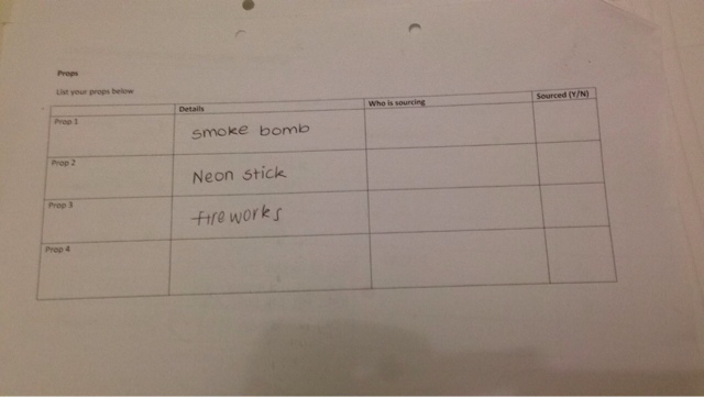
Our group is also going to find a way to incorporate both the characters from the video into the ancillary products, most probably a silhouette of both the girls, or a translucent effect which will show some of the synergy through them, such as the smoke bombs or lights or sparklers
We are going to include the various stand out colours that we had in the actual video;
such as the pastel colours
black and white
and bright lights from some of the scenes.
Our group is also going to find a way to incorporate both the characters from the video into the ancillary products, most probably a silhouette of both the girls, or a translucent effect which will show some of the synergy through them, such as the smoke bombs or lights or sparklers
Task 39 notes and ideas for evaluation question 1
Evaluation question 1:
In what ways does your media product use, develop or challenge forms and conventions of real media products?
Conventions of deep house music:
Mise en scene:
The artist was wearing casual clothing which enabled them to move and be free. The same applies to other deep house videos, they are usually dressed up in casual clothing as it allows them to be portrayed as normal people
Editing:
As seen in many deep house music videos, there is alot of use of bright colours and focus contrasting colours. In our video we also incorporated this idea and used bright colours.
Camera:
A lot of conventional deep house music videos have a variety of camera angles, we applied this same technique to our music video, so that the artist didn't look as if they were static throughout
Our music video follows the normal conventions of media products because it includes a narrator
Our music video follows the normal conventions of media products because it includes a narrator
Jessica- changes
Things we need to do before the dealing of music video:
We needed to add in transitions and more use of speed such as slow motion or fast motion.
We included these on the day of the deadline as it wasn't such an important part to focus on whilst editing.
We also included a title of the song at the beginning of the video, we got this idea from the original music video as it gives the audience a better idea of what the song could be about
We also needed to make changes to the video because some scenes weren't in sync with the lyrics, therefore we had to use a specific tool allowing us to drag the clips that were out of sync left or right depending on where it was out of sync.
In addition, we asp needed to get rid of certain clips as they weren't visually pleasing, therefore we included some old footage of dance scenes, which worked better with the genre of the song
Overview Of The Editing Process
Our editing process has been successful so far. We are currently as a group editing our rough cut. I highly doubt that our final edited music video will be similar to our rough cut. But the rough cut is more of a way for us to get use to the editing process and to visualise exactly how we want our final draft to be arranged and edited. We also learnt how to use the green screen just to see if we liked the idea of it. And whether it would match with our music video.
We didn't end up using green screen at all as we felt that it wouldn't match with the music video. But I learnt a good amount of things when using the green screen such as: how to duplicate , to change the backgrounds. These skills in which I learnt would be really helpful for me in the future if I do decide to edit short videos / music videos.

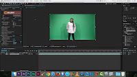


We didn't end up using green screen at all as we felt that it wouldn't match with the music video. But I learnt a good amount of things when using the green screen such as: how to duplicate , to change the backgrounds. These skills in which I learnt would be really helpful for me in the future if I do decide to edit short videos / music videos.


Sunday, 6 December 2015
Saturday, 5 December 2015
Improvements after feedback from target audience
After getting feedback from the class we decided to make a list of things to improve.
- Brighten the whole video
- Fix Lip syncing to match the song
- White screen backgrounds need brightening
- Need to fix the sparklers footage, slowing down some of it making the heart visible and the fast forward the rest of that footage
-Get rid of the overlayer (2:30)
- Head Cut off & Brighten (2:40)
- Fountain scene needs to be replaced (2:52)
-Put "I Loved You" at the beginning
-Replace (49sec)
-Fade out title
-Cut up the footage thats too long
Before the deadline we followed this listed, For the scenes we shot at Kings cross, most of the base tracks had half our artists head cut off. This is because we used a different camera, so we were able to change the framing of the whole video in order for it to match.
As we went through the music video we brightened all the shots and fixed the scenes where the lip syncing was off. We put the title at the beginning of the music video over the time lapse to introduce the song.
Improvement needed before deadline
After the rough cut feedback from our target audience my group and i put a lot of thought into want we wanted to do next. As the deadline was so soon we had limited time to re-shoot and edit the music video. We set a date to film and dedicated our spare time to editing our music video we also decided to work on the feedback we got from the class. We made a list of things we wanted to get done. For example making sure all the footage is in sink, put the title of the song at the beginning, replacing some footage and fade out the ending.
We also got people to look at our rough cut and give us feedback, this helped in the process of editing our footage and knowing what people liked during the music video and what the though needed improvement.
Before the deadline we also had to re-shoot as we found out we couldn't use the shots from shoreditch and the base track in Greenwhich due to lighting issues.
Re-shooting
After editing we noticed we had to go out to film again, as we viewed our footage from previous filming session and found that we did not have enough base tracks to include in the music video.
We decided to go a film after college as that was the only time during the week that we were all free. We had to re-shoot before our next media lesson, we used Tia's camera. We went to film at Kings Cross as we wanted some base track with a brick wall. However we also found somewhere else within the location to film and ended up getting a number of great shots.
What went well:
-we managed to film some great base tracks with a brick wall background
-we used top lights while filming which we felt was much better than the lights we used before
-good lighting
-Location was prefect as we were able to film in different parts making it look like two completely different locations
-We focused on getting a few close ups as we were lacking some
-nice shots of both girls having fun
What went wrong:
-It started to train, luckily we had an umbrella protecting the equipment
-It was very cold and our artist did not have a jacket on as we wanted her in white
-Location was private property (we had to ask permission before to film in the area)
This filming session was very productive, we got a lot done as we had to think about getting as much shots as we can as this was our final filming session. We were able to film base tracks with different angles making sure we had a variety to chose from while editing.
filming session number 5
For this filming session we decided to go and filming in Alexandra Park. This is because we wanted to film a base track with the beautiful view behind.For this session we planned to film some base tracks, take some establishing shots and film both girls having fun around area.We also decided to film a time lapse.
What went well:
-We filmed some very successful base tracks from different positions. For example Renee Sitting down with the view behind her, Renee walking towards the camera singing
- Lots of energy throughout the performance
-Got lots of daytime shots which meant we didn't have to use the lights at all
-Took some ancillary shots with the background view on Tia's camera
-Time lapse
What went wrong:
-Didn't get much shots of both girls
-Windy. cold weather
Overall this filming session was successful.
Second Filming Session (part 2)
After going to the gallery we planned to also go to Greenwich to film our Emirates cable car scenes and get some base tracks done with the pier in the background.
What went well:
-very productive day, got a lot done
-filmed in 2 different locations
-base tracks from different angles
-The view from the cable cars was amazing
What went wrong
-Because we left the gallery late it got dark while we were filming
-Memory cards were not working which meant it kept failing to record throughout the day
-Journey took up some time
-Setting up the camera while in the cable cars had to be done quickly so we didn't waste time
-Lighting was to harsh and was not always pointed at the artist
Filming Sessions
We managed to film in all our locations. Alexander Park, Kings Cross, Shore ditch , O2 Arena ( Cable Cars)
Overall our filming sessions were successful, we had to focus on making sure we got the correct shots so that we didn't have to re attend those locations again in the future. Even though we tried that technique we still weren't satisfied with all the shots we had. For example In Shore ditch we had to re attend because ideas got changed and we also felt that our shots were not to perfection.
In regards to our mise en scene , our theme was red, but after a while it changed to black and white. They're plain colours which match with any type of edits and background. The times we filmed in 323 using the green screen was very successful. But when editing we didn't end up using those particular shots for example, with the dancing scene... we had a idea of duplicating the dancer and changing the colour of the duplicates to match our "red theme" but when editing it we realised that it didn't fit in with the music video... it would look extremely random hence why we didn't use it.
When we filmed in shoreditch the first time , we got loads of shots for example , Jessica and Tia on the swings in the park with our red tops on , Tia also attempted to lip sync but we felt that Jessica was more confident behind the camera in comparison to Tia. It is important for the artist to look comfortable when performing, an awkward looking performer isn't appealing to the audience. During that filming session we also recorded some running scenes, to show both Jessica and Tia having fun, but when we reviewed the footage it wasn't to our standards.
When filming in Kings Cross it was extremely successful. The shots came out perfect , everyone was motivated and we got so much done. Base tracks from different angles were recorded on that day. We also had appealing scenery- colourful water fountains. The fact that we did a base track in that location made it really effective as there was a lot going on in those specific shots. Its nice to have loads to look at in some shots.
The footage from the cable cars were successful,we filmed a base track of the two girls just having fun, so when it came to editing all we had to do was pick out bits which we felt would fit in greatly.
Also with the gallery we filmed in a smoke room , we received loads of positive feedback about those shots as it was different in comparison to others music videos.
Friday, 4 December 2015
Production - Editing Session (On Deadline Day)
Final Editing Session
One the day of the deadline day each member of the group came at different times to edit and put final touches in. We first cut up the two videos of Jessica dancing and made them interchange between the two when the beat was picking up. We were considering taking to the footage that we had taken inside the exhibition as we felt that it looked quite random. We enquired some student and teachers on what they think and whether or not we should take it how. Most of the feedback we got was that it was a very interesting shot and it looks visually interesting and gives the video a different dimension, therefore we decided that we will stick to having the shots in.
As we used to different camera's we had to put filters on. Some footage such as the footage taken in Alexandra park and the white background needed to be brightened up as they looked too dull, so we adjusted the brightness and contrast of them.
We also decided to place the title of the song at the start of the video as it is conventional for our artist to do so. We then added some transitions on to the title to, which made it fade in and fade out of the screen. We also added the cross dissolve tradition at the end of our music video and we wanted it to fade out when Jessica was walking away.
Our biggest problem that we faced during this editing session was that the scenes that we wanted to use were out of frame. We didn't notice this when we were filming, as you needed to stay within a certain rectangle on the camera to avoid this. This lead to many shots cutting of Jessica's head. However, with the technicians help we were able to sort this problem out but it did take a long time to render, which lead to us wasting time.
Through out the course of this editing session we had people looking over our work to spot if anything was out of sync, due to us seeing it all day it was hard for us to spot it, so we need a fresh pair of eyes to view it. Some shots were out of sync but with a tool we were able to fix it by just moving the clip a few frames to the left or the right, instead of moving the whole base track which could have been very time consuming and difficult to manage.
Thursday, 3 December 2015
Final Editing Session
Final Editing Session
For one of our final editing sessions we had made sure to get feedback once we cut our clips into place and before we put in filters. Our teacher suggested that we remove the random time lapse from the beginning. Although we tried to show the view it wasn't very visually interesting as it wasn't able to showcase the view in an appropriate way. The way we could replace it is by making the first clip of the artist a bit longer as we only see the artist for a short period of time in that clip and the audience wants to see the artist within that clip for a longer time.
Also, we need to replace the shoots of the artist in the exhibition with the neon smoke as the audience isn't able to make out what they are doing and they aren't able to see the artists face.
In our editing session we over layered two of our clips together. We over layered a close up of the artist singing with the clip of Jessica and Tia playing with the sparklers. The majority of the lesson ways surrounded by use fixing the clips into place and over layering the right clips together. We also put a filter over the first couple of clips to brighten the colours up a bit. We were working on over layering the clips of the cable cars in the night time with another clip of Jessica singing or Jessica and Tia inside the cable cars.
Monday, 30 November 2015
Feedback On Rough Cut from the target audience
Class Feedback On Rough Cut
From the feedback that we received from our class, the strengths were that the framing of our shots were good and some of the shots that we took were good. This includes the shot were the artist is walking towards the camera and the camera is moving backwards.
A weakness is that some shots went on for too long as they went cut to the beat. Also, a filter is needed over some of the shots as they look a bit dull and needed to be brightened up.
Overview on todays lesson
For todays lesson we aimed to finish putting all our footage in order for our music video. We also want to start adding special effects as we like the idea of our music video featuring a range of different neon colours.
The changes we have made are replacing the clip at the start when the singing starts to the clip where the artist was walking towards the camera and the camera moving backwards.
Altogether we hope to finish editing the whole music video successfully by thursdays lesson.
Reflection on the Rough Cut Feedback
Reflection on the Rough Cut Feedback
On our Thursday lesson our teacher looked at our video. Some of the feedback that we got was that the time lapse that we started off with didn't make sense and seemed to be out of place. Also, he felt that we needed to start with a different clip when the singing started, as the movement of the camera in the clip didn't match up to the beat of the song. Since we used two different camera's to film our footage we have to put a filter over the video so that you can't tell the difference between the footage used. Also, the framing per second on the footage from the two different camera's was different. Therefore we had to slow both of them down to 23.5.
Taking on board the feedback we made some adjustments to our video. This includes changing the clip that we started with when the singing part of the music came. We replaced it with a clip where the artist was walking towards the camera and the camera was moving backwards. We felt like this clip was suitable to be placed at this particular point in the music video as the movement of the camera matches the beat of the music. Also, further improvements that we need to make is that we still need to put a filter on so that the footage from the different camera's match up and to deepen the colours within the video so that they look much richer because at the moment the colours look a bit flat and dull. We will place the filter later during the week once we have completed most of our editing and have place the majority of our clips in the right sequence.
Monday, 23 November 2015
Rough Cut Feedback
Rough Cut Feedback
Our main overall feedback that we were given was that the brightness and contrast of our video needs to be adjusted as it looks a bit flat. We need to deepen the colours in the video so that the colours look deeper. Some of the improvements that need to be considered is that the scenes of Tia dancing need to be edited and placed within the video. We decided that the edited dancing scenes will be placed within the video when the beat starts to pick up. Also, we decided that we will place a filter over the footage to give a more pastel effect.
Sunday, 22 November 2015
Production - Filming Session 5
Filming Session 15/11/15
On the 15th of November we went to film in Alexandra park. We filmed some shots of Jessica signing and a few scenes of both Jessica and Tia 'messing about' and 'having fun'.


Production - Filming Session 4
Filming Session
We filmed again in room 333 to re-shoot some of our base tracks as we felt the previous time we filmed, the red lighting was a little to harsh. We also shot some scene where Tia was dancing against the green screen.

Developments
After our pitch we did a bit more research and found a new location where we could film. We found an exhibition at the welcome collection by Ann Veronica Jannsens called 'State of mind'. Its an exhibition of coloured mist which tied in very well with our synergy of different vibrant colours.


Saturday, 21 November 2015
forth filming session
Our forth filming session took place in room 333 again. We had to re shoot as we did not like any of the footage from the last filming session. We done some base tracks and also got some footage of Renee and her friend dancing.
What went well?
During this filming session we used the green screen instead of the white screen. This is because we decided the lighting was to harsh in previous shots however we though it would be better if we created our own background using the green screen.
What went wrong ?
-
What went well?
During this filming session we used the green screen instead of the white screen. This is because we decided the lighting was to harsh in previous shots however we though it would be better if we created our own background using the green screen.
What went wrong ?
-
third filming session
These shots have help us test out our shots with the red colour, it also helped us get an idea of where we want to position the camera and the artist.
What went wrong?
- Renee was sitting throughout which meant there was not a lot of movement
- the red lighting was too bright
-we used the lyrics video instead of the original music video, so while we were editing the footage didn't match
Here are some pictures of our filming session:
What went wrong?
- Renee was sitting throughout which meant there was not a lot of movement
- the red lighting was too bright
-we used the lyrics video instead of the original music video, so while we were editing the footage didn't match
Here are some pictures of our filming session:


For our next filming session we need to film a base track with the red lights and our artist standing up throughout.
Tuesday, 17 November 2015
Green Screen Tutorial
This is a little tutorial of us learning how to use the green screen. It helped guide us very well when it came to us attempting to use it on our own.
Monday, 16 November 2015


Production - First Filming Session in room 333
Here are a couple videos of my group behind the scenes of filming. This was the first time we ever filmed in room 333. Ever since then we have had the hang of it. We know how to control the lights in order to avoid any shadows in the background such as the shadow of the camera. During this filming Session we filmed Jessica Lip Syncing and Me (Tia) dancing. After reviewing the footage from that filming session we had many things which needed improving. Jessica was too static so we decided to arrange another filming session in room 333 having her moving around a lot more. As it's important to have a exciting feel to the music video, as the song itself gives us that kind of vibe - exciting.
Monday, 9 November 2015


Subscribe to:
Posts (Atom)